Official brand assets
Hulp Brand Kit
Logos, app icons, social preview artwork and colour values for internal decks, press, partner integrations and co-marketing.

Digital assets
Icons and social images.
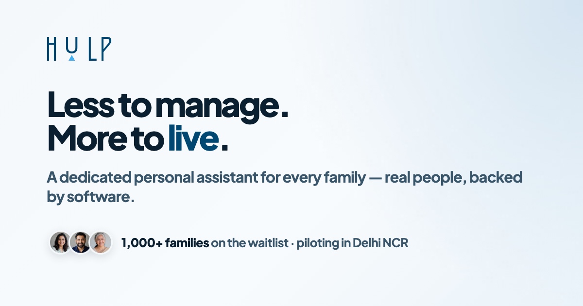
Ready-to-use files for app surfaces, browser tabs, saved shortcuts and link previews.


Colour codes
Core Hulp palette.
Use the primary blue for the wordmark, the accent blue for the triangle and interactive highlights, and the ink/canvas colours for product surfaces.
#004772
Logo letters, primary brand surfaces
#43B0F1
Logo triangle, highlights
#0A2030
Primary text
#39556A
Body text and captions
#F5F8FB
Light backgrounds
#08171F
Dark mode backgrounds
Usage notes
Keep the mark simple.
Use the supplied SVG when possible. Keep generous clearspace around the logo, use the blue mark on light backgrounds, and use the white mark on dark backgrounds.
Do not stretch, recolour, outline, add effects, crop, or rebuild the HULP letters as live text. Do not use the older lowercase wordmark.
Ask for help